
Larry Kunz has written a great article about the disparities coming up in content writing, and how we can start to fix it.
I recommend reading:
Are you ready for the future of content?.
Larry Kunz has written a great article about the disparities coming up in content writing, and how we can start to fix it.
I recommend reading:
Are you ready for the future of content?.

In a nutshell, the 2014 STC-PMC Mid-Atlantic Technical Conference was better than last year, in my opinion! A slightly different format, a different day, more networking, and excellent speakers made for a fantastic event.
Okay, now for more details.
First, having been a member of the conference’s planning committee this year, I know that a lot of work went into making this event a success. Kudos to my fellow volunteers! Special care was taken to choose the best proposals submitted, and it definitely was reflected in the best of the best! There were so many great subjects to choose from that even among the presenters, some were saying to each other, “I want to go to your presentation, but I’m presenting at the same time!” I think some of the attendees also had hard choices to make, since sometimes they couldn’t decide between topics during a given session!
Nicky Bleiel, who is currently the President of the STC, gave the keynote address for the conference. She talked about flexible content with responsive design. The main message of her talk was that with responsive design, technical communicators can create and deliver a single responsive output that will work on thousands of devices, including new devices, old devices, and even ones that don’t exist yet. She showed us a few examples, such as Microsoft and Lycos websites in which the content remains the same, even though the output in different browsers changed to work with the size of a particular browser size. Many companies started making separate mobile sites, but the content was not the same as the full site. Responsive web design is Google’s preferred configuration when ranking sites. Mobile users want content parity, meaning they want everything that desktop owners have, thus they want one Web. Fluid layouts, fluid images, media queries in the coding, and stacking or collapsing grids are the key to creating responsive design.
During the first breakout session, I gave my own presentation, “Blogging Out Loud: The Basics of Blogging,” so I didn’t get a chance to see anyone else’s presentation during that time, obviously. I did have a lot of people in my room, which pleased me, and we had a great discussion during the question-and-answer time. It was a great group, and smart questions were asked.
After a lunch break filled with awards, volunteer recognition, food, and networking, I chose to attend Todd DeLuca‘s talk about volunteering your way up the career ladder. Todd kept the presentation fairly open, sharing some of his own insights about volunteering from his personal experiences and how they were able to apply to his professional life. The group attending participated by sharing ideas and experiences themselves about volunteering, bringing about a great conversation. Todd’s main idea was that it doesn’t matter how big or small the contribution, or if the volunteer opportunity is inside or outside of work. The experience fulfills you when helping others, but also fulfills you by allowing you to gain skills and experience that helps yourself. I think one idea he presented resonated with me, which was that volunteering is an offer to help, but it’s also a promise that evolves, as it’s a commitment that is followed through and builds trust. I also liked his point that volunteering is a safe environment to grow because usually there is less risk and some mistakes are expected, so the environment is often more nurturing than work. That’s a great environment to learn! Todd has been volunteering for things inside and outside of his job for years, related to tech comm as well as unrelated, and felt that he’s reaped benefits that apply to where he is professionally. I know that Todd will be speaking at the 2014 Spectrum conference for the STC Rochester chapter in a few weeks, and he’ll also be speaking at the STC Summit on this topic, so I encourage you to attend to get more details and ideas!
The last presentation I saw for the day was by Neil Perlin. Neil and I have known each other through both e-learning and tech comm social media circles for a while now, but hadn’t met before. It was a real treat to meet and chat with him, but to also hear him speak, as I know he’s rather popular on the e-learning and tech comm circuits. Neil’s talk was about emerging technologies, which is a subject he’s excited about and presents frequently. Neil covered a wide range of topics that are currently in use now and look to be expanding in the future. These topics included more mobile content that needs content strategy to steer it, more use of analytics to understand what our users need and use, using social media extensively, augmented reality, wearables, the use of the “cloud” and cloud-based tools. He also stated that there is a need for standards in order to future-proof our materials to avoid problems as technologies come and go, since it’s so hard to predict what will everyone use. He advised us to stay current by going to conferences and staying on top of general business issues and trends. Business issues can kill a technology, so staying current on your company business is a show of tech comm’s support of corporate strategy. His last bit of advice was to review your tools regularly for environmental change, accept the rise of content and social media, don’t denigrate tools in favor of writing, and embrace and help shape change!
After the conference, WebWorks and Publishing Smarter hosted a nice post-conference get-together at the Iron Abbey, a pub-restaurant down the street from the conference venue. It was a great treat of libations, appetizers, and networking further with tech comm peers.
Overall, it was a great experience. I liked the format this year because it felt more relaxed with fewer breakout sessions. Presenters weren’t rushed as they often are at events like these, and more time was allowed for networking with everyone. Perhaps it’s because I’d had a different experience last year as a total newbie that it was so different to me, but I don’t think so. The topics of the conference, the agenda, and the camaraderie of those hosting at the “City of Brotherly Love” came together into a pleasant Saturday of learning. As a smaller, regional conference I think the more intimate setting helped it be a more personalized experience for all, thus it was a big success.
(To any of the fellow speakers I reviewed here–if you’d like to add or correct anything that I summarized here, please feel free to do so in the comments area below!)
If you are in the Philadelphia area next year around mid-March, I highly recommend coming to next year’s STC-PMC Mid-Atlantic Conference. I guarantee you’ll enjoy it.
I came across this via Viqui Dill on Facebook. This is done by Carolyn Kelley Klinger, who is a very active member of the STC. This is a great overview of the potential of tech comm in the coming year. The future’s so bright, I gotta wear shades!

At the end of my trip attending the Intelligent Content Conference in San Jose, California, I had the opportunity to visit the Computer History Museum in nearby Mountain View with a group of other conference attendees. It was a great little excursion, especially for a geek mom like me. Every kind of computing device in the last 150 years (give or take) was included in this place. I felt particularly old when seeing several of the first computing toys like “Merlin”, “Donkey Kong”, and “Quiz Wiz” displayed (I had one of them, my sister had another, and I wanted the third!) I also saw some of the earliest versions of Apple and PC computers. I remember them as well. My father brought home an Apple II from the school where he was an administrator, and I remember playing some of the earliest versions of Castle Wolfenstein and doing simple computer graphics in BASIC on it. Good times.

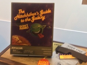
But one items caught my eye, which was the game shown in the image above. It was the computer game of “The Hitchhiker’s Guide to the Galaxy” from 1984. My own disclaimer is that I’ve never read the book or played the game, but I’ve watched the movie and enjoyed it. I also know that the author of the book, Douglas Adams, was an occasional writer for Doctor Who for a time, so seeing this computer game picqued my interest. I also remembered that Douglas Adams wrote and created the mini-movie called, “Hyperland”, which starred the former Fourth Doctor, Tom Baker, and talked all about hypertext theory. See my post about it here. If you haven’t watched it, you must take the time to do so, as it still stands the test of time and is well done! It occured to me that Douglas Adams really understood the idea of hypertext when he wrote “Hyperland” due in part to Doctor Who, simply because the entire show is actually all HYPERTEXT. While it seems that we are going forward in a linear way, we are actually pulled back and forth into different times and sequences–much like hypertext. Think Elizabeth I references throughout or that the Doctor can be in several places at once–he may be in Victorian England as one version of himself, while in Victorian England as another version in another part of the country on the same day, for all he knows. Same story of the same man (essentially), but two different directions.
But anyway, I digress. I thought it was really cool to see this old game displayed at the museum, and didn’t think anything more about it until I saw this article come out:
BBC Revamps ‘Hitchhiker’s Guide to the Galaxy’ Game
What’s this? Evidently, the BBC is revamping and re-releasing the game as a 30th Anniversary edition. Who knew that an old game written by Douglas Adams, who understood hypertext theory before it was mainstream, would stand the test of time? I’m excited that it’s out, and have played a round already. It’s good fun. Go to the link above for the article, and find the game on the BBC website. It’s a great example of the use of hypertext writing well before people started to understand how to structure content and employ reuse on the Internet. Give it a try. You’ll enjoy it!
 While I haven’t been an official content strategist/publisher for that long, I actually have been web publishing for a long time now. Over the years, I’ve learned the difference between good practices and bad practices, from experience and through classes and webinars I’ve taken. I’d like to think that from all of this that I’ve learned to be a pretty good content strategist and web publisher. Even so, I still don’t understand why people find content strategy difficult to understand, and why creating a high standard of quality in content strategy and publishing content that’s user-friendly is so difficult. It makes me want to pull out my hair it frustrates me so much!
A recent occurrence of this lack of comprehension spurred my intense frustration again. I’ve experienced this before in many places that I’ve worked, but this was just the latest occurrence that sparked my ire. Among several projects that I’m working on at work, one of them is managed by another web publisher. In our project, we’ve been assigned to revamp a current internal website. Par for the course–this is what we do. The project manager was given an outline by the internal client, along with the main content, which included documents to be linked within the pages. That sounds fair enough. Of course, as most technical communicators know, content written or planned by non-technical communicators usually needs some help to make it more user-friendly. In this case, much of the formatting of the content was…less than desirable. In addition to making the outward facing part of the microsite user-friendly, we also had to make the back end–the organization in the content management system–user-friendly as well, since the client would be maintaining the site after we were done setting it up. This all sounds like a reasonable task, and a technical communicator would be just the person for the task.
However, I found myself frustrated with the process, or rather, the quality of what was starting to go up. The project manager gave me sections of the website to work on and format. I found it difficult to decipher the client’s outline because the outline was written poorly. Nevermind the actual text itself, which wasn’t always well written either. I couldn’t really touch that. The outline was meant to help the web publishers–the project manager and I–understand how the client wanted the site organized. At a high level, the main outline seemed fine, but when getting into the finer details, it easily fell apart for many sections. I often had to consult the project manager for clarification, as I wasn’t supposed to be talking to the client directly, for some reason. Whatever.
The other problem was that nothing was labelled in a way that made sense or was user-friendly for use on the front or back end. I can understand that people have different naming conventions for files that make sense to themselves. But when creating the name of a file that is some sort of document or form to be used by others, and not giving the document a title? I don’t get that. For example, if the document is a quick reference guide about how to use your Lotus Notes account, then the text on the web page should be something like,
Quick Reference Guide for Lotus Notes
and the file on the back end should be called something like, “QuickRefGuide_LotusNotes.pdf,” or something like that in order for the user to understand what they are downloading. The file shouldn’t be called something like, “QFC-LN_ver1_01.02.14.pdf”. Down the road, someone will look at that downloaded file and question what that file is. Wouldn’t it be easier to title the file more appropriately rather than have to open it? I’m sure some would argue something about versioning here, but in our CMS, there seems to be a bad practice of putting many versions of the same document up with different names rather than utilizing the versioning function of the CMS. I use the versioning function on the CMS extensively on the other sites I work on, so this confuses me that others think it’s okay to clutter up the system with many versions of the same file under different file titles.
To add to the grief, the client sent files in zip files which yielded unorganized folders and files as well. In this instance, the project manager would keep the folder convention the client had given, even when it didn’t make sense. When I questioned the project manager, I received the response of, “The client had them organized that way, so we’ll leave it because they’ll be maintaining it later.” NOO!!! The organization didn’t make sense, it didn’t follow the client’s own outline, and complicated the back end so that it didn’t make sense! I am confident that the client just slapped some folders and files into a zip file, and sent it along for us to decipher it. I spent the past year cleaning out another department’s very large microsite doing just this–giving files more appropriate names and creating a folder system that would make sense to ANYBODY going into the site to find the page or document needed that followed what was on the front end. And now, when changes need to be made, it’s easy to find the appropriate documentation.
As I’d do the pages I was assigned to do for this new microsite, it became clear to me that the project manager didn’t care. Granted, it’s a big project, and we want to get it done quickly. It would be easier to be able to merely cut and paste content into the site and be done, but it’s also our responsibility as content strategists and technical communicators to make things easier, more streamlined, more user friendly for both the front end and back end. The mantra for all technical communication is always user advocacy– for all aspects of the project, whether it be digital or print.
This means that there needs to be attention to details, thus the “copy and paste” method of entering content into a CMS system alone is not enough. I used to be known at one job as the “Table Queen” because the CMS used didn’t like the copy and paste of tables from Word, so I usually had to go into the HTML code and fix everything so it displayed correctly–or if I could, make it display even better. Tables are something simple to figure out in HTML, but even so, it was something that other people at that particular job with the title of “web publisher” did not know. (They didn’t even know HTML at all, so why were they called “web” publishers?) It was important to make the pages look consistent and be organized in a way that would allow the users to find information quickly and easily.
In this project, I’ve found that the project manager isn’t taking the lead in setting the standard for the website. I’ve been disappointed that the same standards that I would expect aren’t being displayed by this person. It frustrates me, but like I said, it’s not the first time I’ve encountered this reluctance to make a website work.
Do understand that I’m not a perfectionist. I let things slide to a certain point, too, and post things that are “good enough”. But in the end, it comes down to the foundation of the website. If the foundation and the building blocks aren’t sound, it’s not going to hold up. In content strategy, if the infrastructure of the site isn’t sound, and the content isn’t well defined, then the website will reflect that disorganization.
Content strategy, at its core, is really easy. It’s all about organizing information in a way that it can be easily searched and retrieved. It’s about labelling files and folders so that they make sense. Val Swisher’s analogy about content strategy being like one’s closet still stands at the heart of it. If you can organize your closet and identify the different clothing pieces in order to categorize them, then you understand how to do content strategy. The only difference is that instead of having shirts, skirts, pants, and shoes to organize, you have folders of documents, webpages, and multimedia. The method of making sure that users can find those documents, webpages, and multimedia should be streamlined, clear, concise, and user-friendly. As content strategists and user advocates, it’s all about making sure that what the audience is viewing looks and reads well, and what the content managers can maintain easily.
Ultimately, when creating a content strategy and setting it up for maintenance, do it correctly now, even if it’s time consuming. If for no other reason, it’ll save time and headaches later. It’s not difficult. It’s just common sense.


You must be logged in to post a comment.