One of the things that I hope I can do more often in 2013 is attend more tech comm conferences. There are always really good speakers, and I find that I truly learn so much from them.
Joe asked me to pass along the following information:
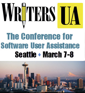
I’m writing this note to let you know that registration is open for the WritersUA conference….We will be in Seattle, March 7-8. This will directly follow the ConveyUX conference that I am managing for Blink Interactive.
You can find all the details here: http://writersua.com/conference. Early registration discounts end on Saturday. I’m use a different format for the WritersUA event that offers a more affordable price and a reduced time commitment….Also, I’m hosting a number of free webinars for community groups. If you belong to a group that might be interested, let me know.
Thank you, Joe
I looked at the website, and it IS one of the more affordable conferences, and I know several of the speakers presenting during the event, and they are all top notch! So, if you fancy a trip to Seattle in March for some great tech comm info, check it out!
This post is just a quick summary of the Adobe Day at LavaCon 2012 series from this past week. As you see, there was so much information that it took six posts to try to summarize the event!
Being in Portland, Oregon was great. It was my first trip there, and being a native Easterner, my thoughts pushed me to that pioneer spirit of moving westward in this country. Once there, I saw a hip, young, modern city, continuing to look towards the future. The information I gathered at Adobe Day was general information that was endorsement-free, and practical information that I can use going forward as a technical communicator, and that by sharing it, I hope that others in the field will equally take on that pioneering spirit to advance what technical communications is all about, and bring the field to the next level.
To roundup the series, please go to these posts to get the full story of this great event. I hope to go to more events like this in the future!
As I said, I really enjoyed the event, and learned so much, and enjoyed not only listening to all the speakers, but also enjoyed so many people who are renowned enthusiasts and specialists in the technical communications field and talking “shop”. I rarely get to do that at home (although it does help to have an e-learning developer in the house who understands me), so this was a chance for me to learn from those who have been doing this for a while and not only have seen the changes, but are part of the movement to make changes going forward.
I hope you’ve enjoyed this series of blog posts. I still have many more to come–at least one more that is inspired by my trip out to Portland, and I look forward to bringing more curated content and commentary to you!
The autograph from my copy of Sarah O’Keefe’s book, Content Strategy 101. Awesome!
Joe Welinske of Writers UA followed Sarah O’Keefe’s presentation on Adobe Day. I was especially interested in hearing what he had to say, because the topic of his presentation was about “Multi-screen Help Authoring–How to Deal With the Explosion in Device Sizes.” Anyone who’s read this blog before knows that I’m very much into the mobile revolution, and while I’m usually talking about m-learning more specifically, mobile goes beyond learning, and using mobile in technical communications is connected to m-learning in many ways.
Joe explained that the device population keeps growing! Smartphones and desktops are changing; the sizes between smartphone and tablet devices, whether they be iOS, Windows or Android devices truly vary. The same content needs to be displayed on everything from large monitors to laptops to tablets to GPS to small phones–there are dozens of choices! How do you design a UI (user interface) for all these variations?
Joe explained that different devices have different dimensions, different operating systems, different user interfaces elements…lots of variations to contend with when creating content. He suggested that a “graceful, efficient adjustment is needed,” namely matching the amount of content and the type of content with a device without crafting solutions for each. He contended that responsive design the key as it allowed for adaptive content. Responsive design would allow flexibility for different environments.
Joe mentioned that Scott Abel has touched upon this during his presentation, but Scott later clarified for me on Twitter, by saying, “That’s one way, although I question whether it is the best way…Lesson: Adapt content first, design second. Wrong content, right design = #fail.”
Joe continued by pointing out that one way to accomplish this objective included using HTML5/CSS3, tagging all objects in source code, create device-type style sheets, and including media queries in source. The end result would be a single-source content file that looks and works well on different devices. To prove his point, Joe demonstrated how same source content looked on different devices, specifically the iPad versus iPhone in this example. Joe also showed an example of how he divides the devices by “buckets” when creating his style sheets into categories such as 10″ tablets, desktops, phones, etc. He recommended using a “parent” style sheet, then fine tuning with a device style sheet for each device type. This would help create a graceful adaptation using HTML/CSS and query to allow your content to flow automatically and intelligently. From that point going forward, a technical communicator can consider making mobile the starting point and expanding from there. Joe’s last point was that a small percentage of people from traditional technical communications are involved in mobile projects but the user experience and design skills are actually similar.
I agree with Joe that designing for mobile really does use many of the same skills as traditional design methods, but it does take a little extra time to lay out the thought process and structure needed to make the content be delivered from a single-source to multiple types of mobile devices. It’s a little tricky, but with some careful thought, it’s not really as complicated as it could be. By using single-sourcing and customizing style sheets, multiple output of content can easily be attained. I strongly agree as well that this is the mentality that people need to adopt, whether involved in technical communications or e-learning/m-learning now. I think this opened the eyes of many attendees in the room. Mobile really is an important consideration now in content output!

 One of the things that I hope I can do more often in 2013 is attend more tech comm conferences. There are always really good speakers, and I find that I truly learn so much from them.


 TechCommGeekMom
You must be logged in to post a comment.