
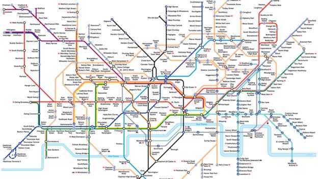
It looks like a cross between an electric circuit diagram and a Mondrian painting – but the London Underground map also revolutionised design. Jonathan Glancey travels back in time.
Source: BBC – Culture – The London Underground map: The design that shaped a city
When I was in grad school, the London Underground map was looked upon as one of the best examples of the ultimate in UX/UI design. It still stands the test of time, even with more rail lines added to the original.
This article is a great look at its history.
–TechCommGeekMom


You must be logged in to post a comment.